TRITON INTERNATIONAL
Triton Container International Limited and TAL International Group, Inc. combined an all-stock merger under the newly created Triton International Limited. They are the world's largest lessor of intermodal containers and chassis. Intermodal containers are large, standardized steel boxes used to transport freight by ship, rail, or truck. Because of the handling efficiencies they provide, intermodal containers are the primary means by which many goods and materials are shipped internationally.
01 / Concept

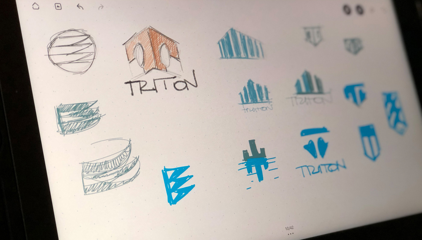
02 / Sketches
03 / Typography and Color

04 / Final Logo

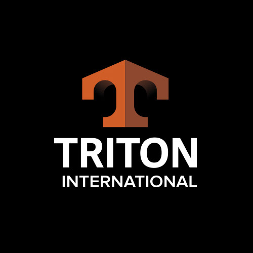
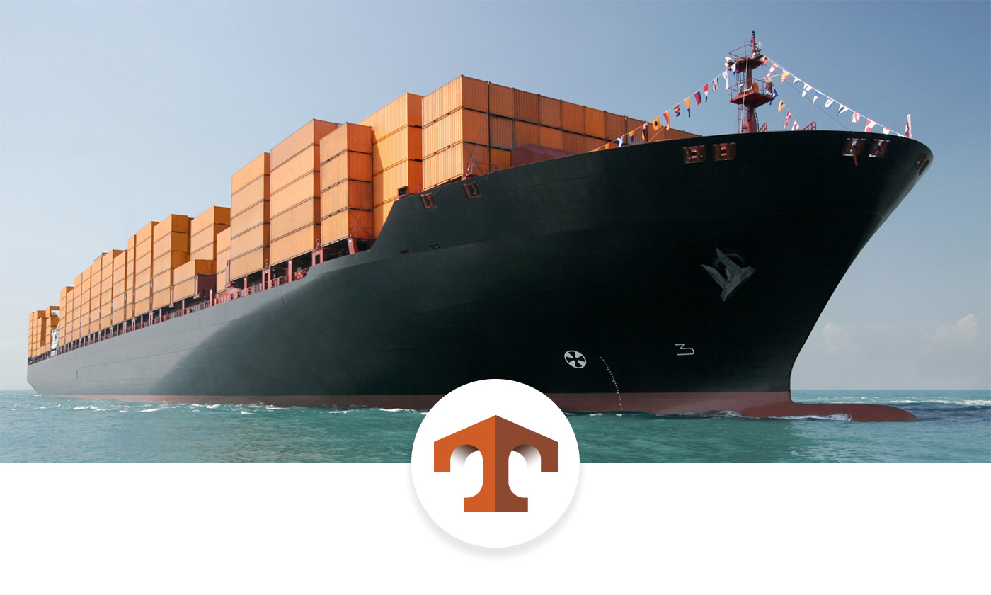
When two of the biggest shipping containers companies merged, Triton was born a Goliath of the seas. It needed a logo that would showcase its grandeur statement in the industry, and he a mark of excellence anywhere in the world, and the result is nothing but it.
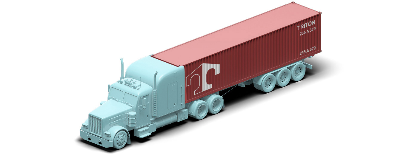
The uppercase T might be the first notice thing, but there is much more to the story. The symbol has a powerful nautical influence. To some might look like an anchor or even the tip of a ship.
The design mimics a modified corner post in perspective – the same corner post that revolutionized the stacking properties of containers.
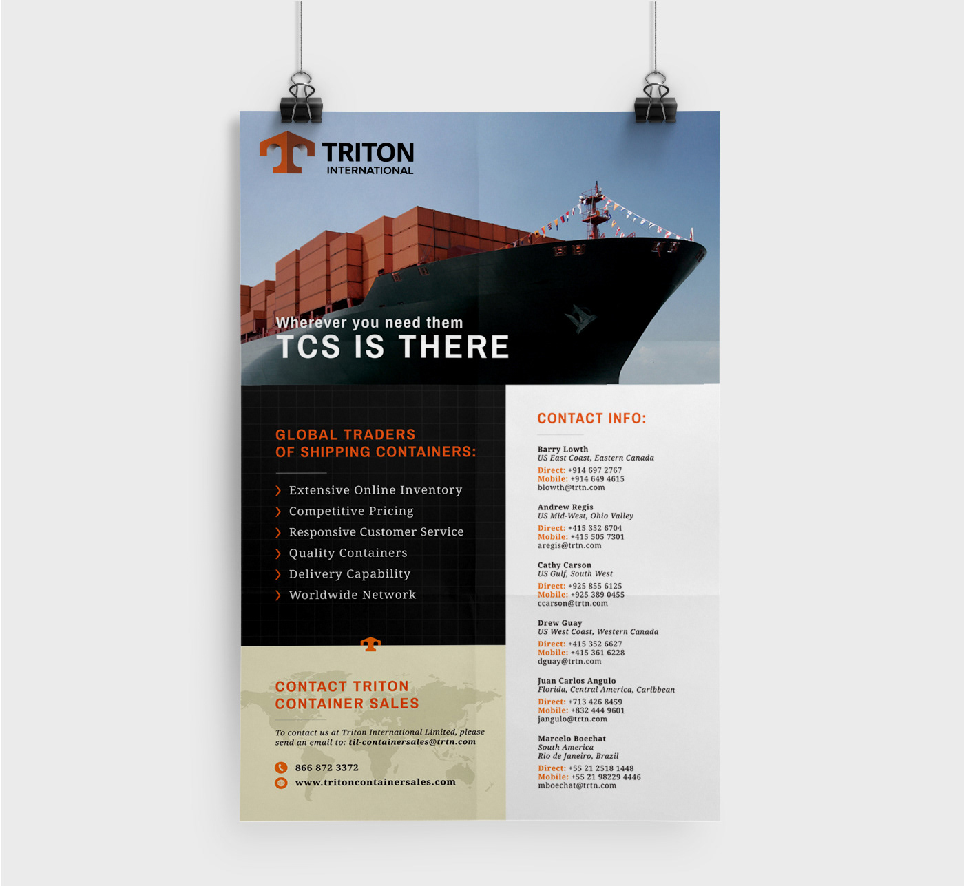
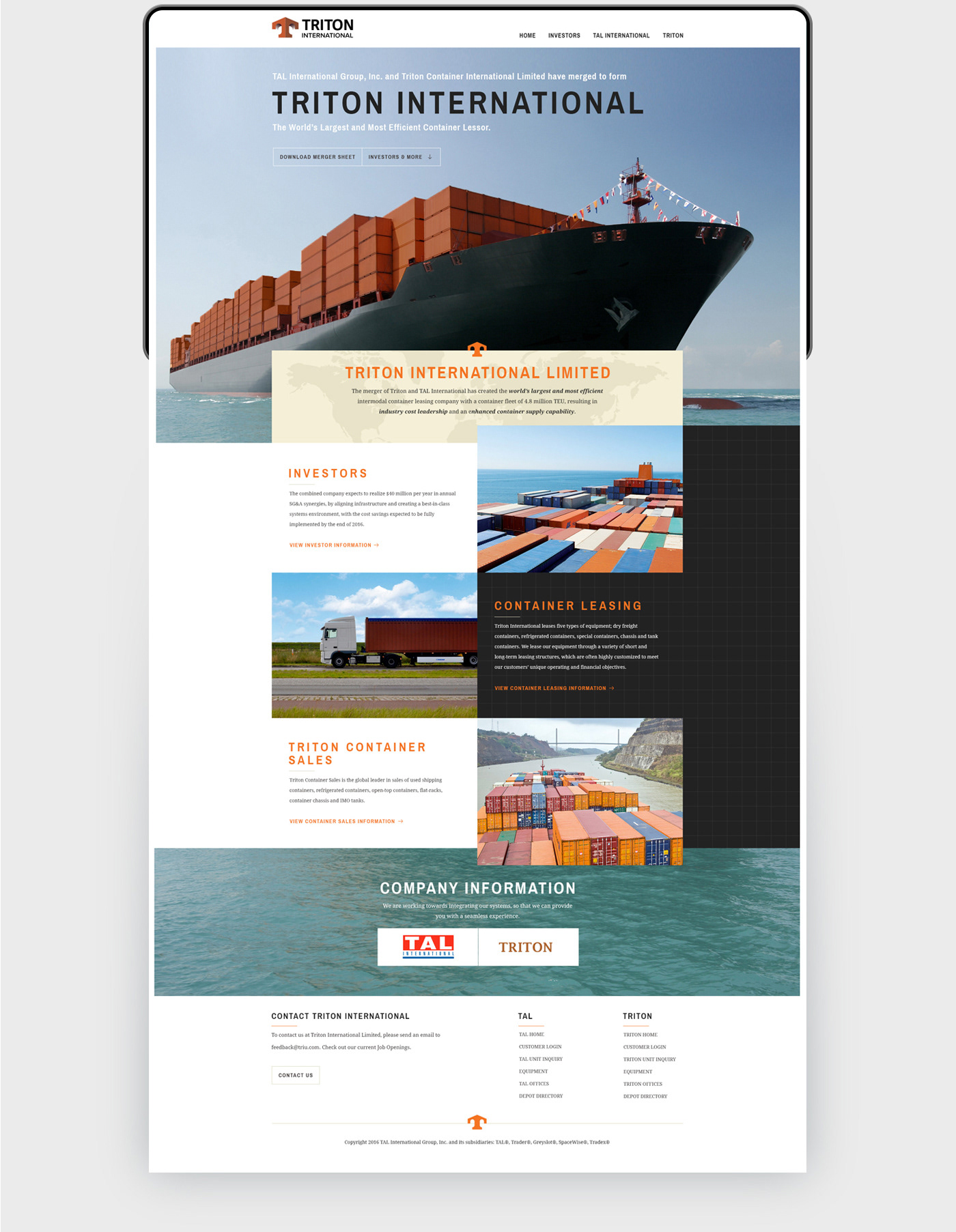
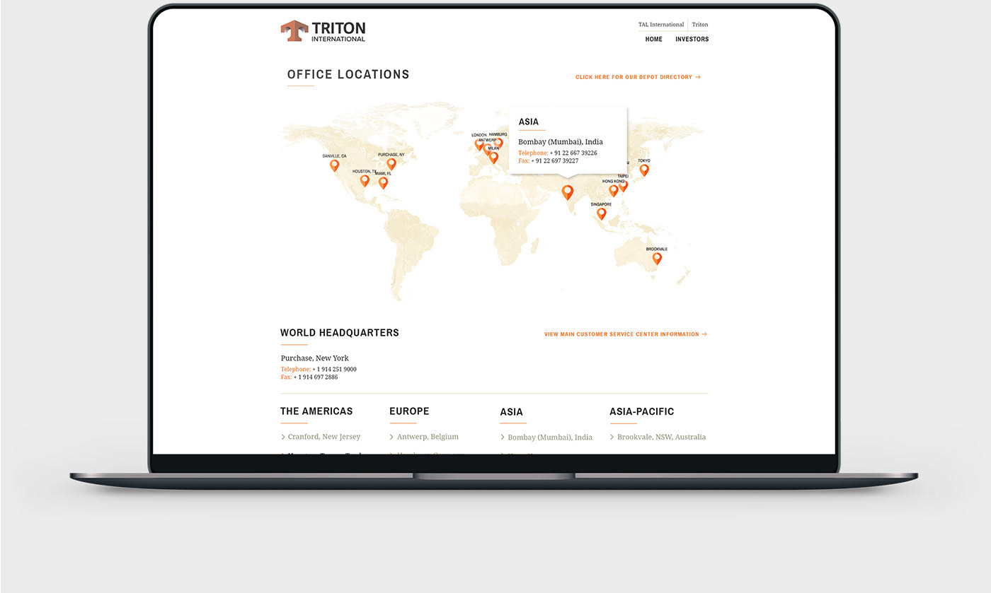
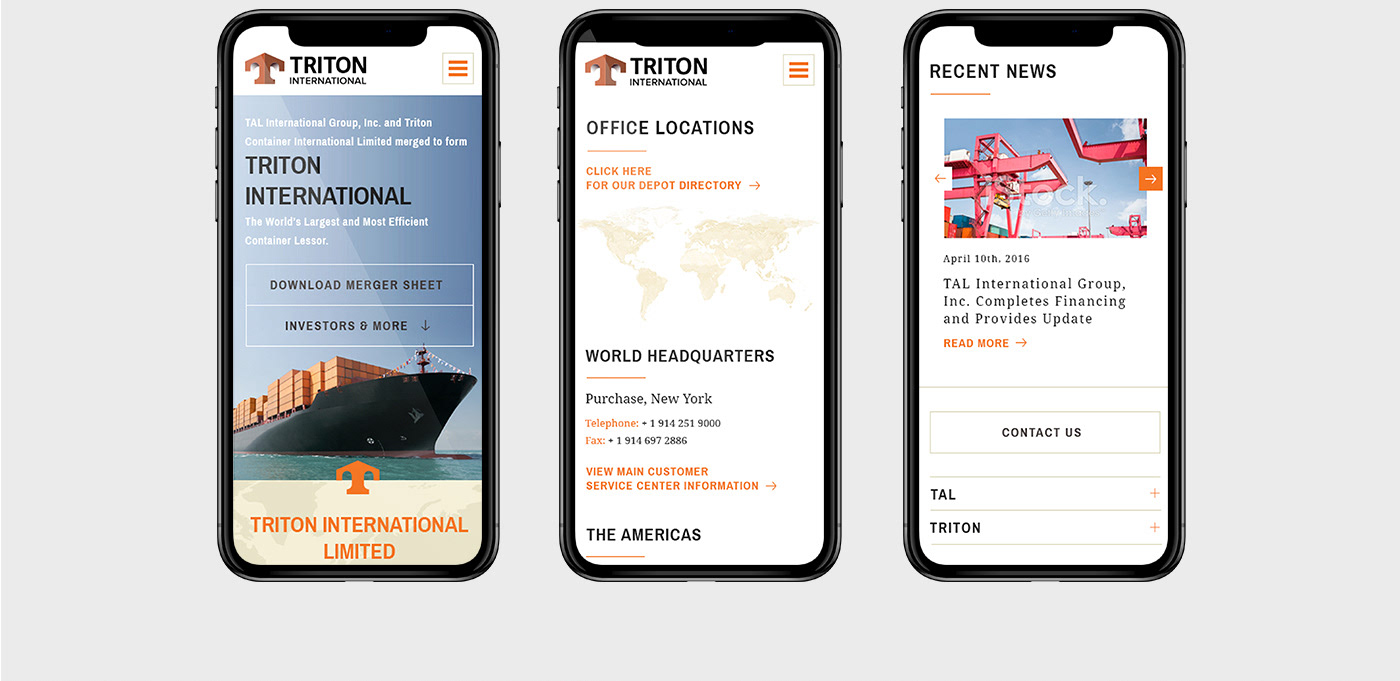
05 / Print and Web
As the Art Director on the project, I led the team that created all the work for Triton moving forward, helping them understand the brand's new vision and aesthetics to all digital and physical media.
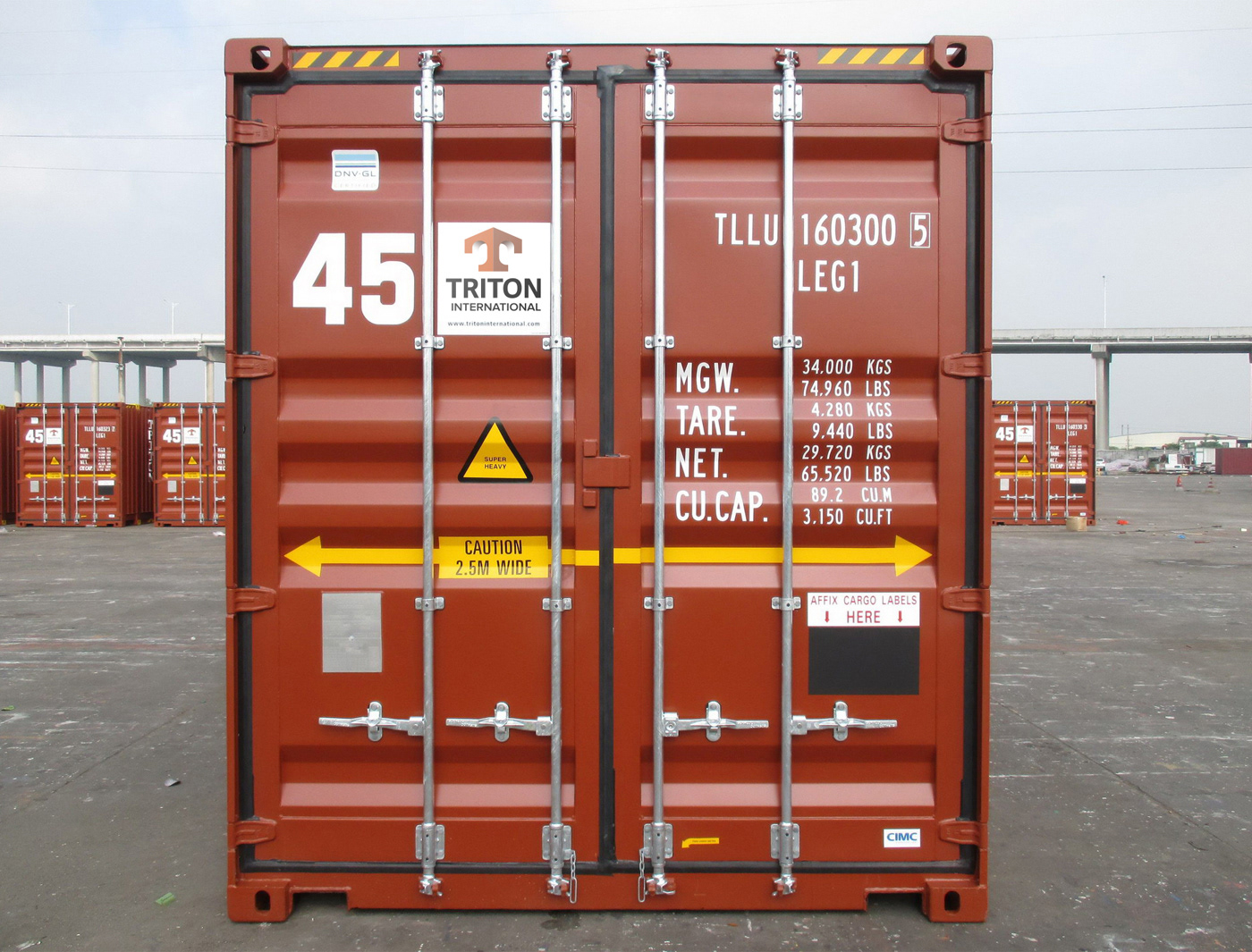
The hard work we produced can still be seen today, all around the world stamped on every Triton ship containers. Chances are that you might have seen one of them while driving around any major highway.