
WEF is a not-for-profit foundation that is headquartered in Geneva, Switzerland. The Forum engages the foremost political, business, and other leaders of society to shape global, regional, and industry agendas. Most importantly, WEF is independent, impartial, and not tied to any special interests.
SkillSET is an initiative backed by leading international technology companies to prepare the tech workforce for the ever-increasing reality that is workplace automation. In short, and I encourage you to read more about this on the WEF site (https://www.weforum.org), SkillSET offers free skills-based training and education to tech professionals to make a career shift in anticipation of automation claiming their jobs shortly.
SkillSET is an initiative backed by leading international technology companies to prepare the tech workforce for the ever-increasing reality that is workplace automation. In short, and I encourage you to read more about this on the WEF site (https://www.weforum.org), SkillSET offers free skills-based training and education to tech professionals to make a career shift in anticipation of automation claiming their jobs shortly.
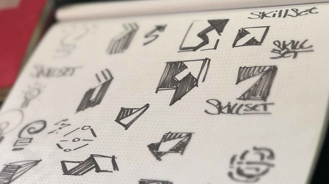
01 / Concepts
02 / Typography & Color

03 / Final Logo

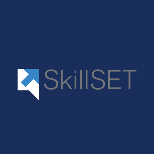
I designed SkillSET symbol to have a solid tech feel. The 45-degree angles that cut the inside of the box create a positive arrow that not only mimics the pointer of a mouse - this being an online portal - but evokes positivity and forwards progress.
The triangle expresses the conversational nature of the platform I designed outside the box, to build the shape of a word bubble. The letter S is now visible, formed by the symbol's interior space, not accidental in this case.
Paired with a fast and contemporary sans-serif font, the overall look and feel of this logo are technological, professional, and accurate.
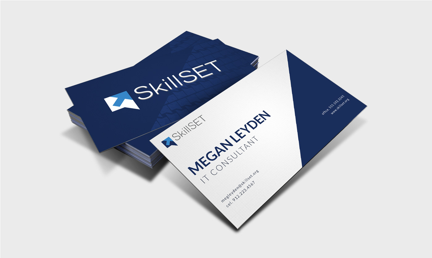
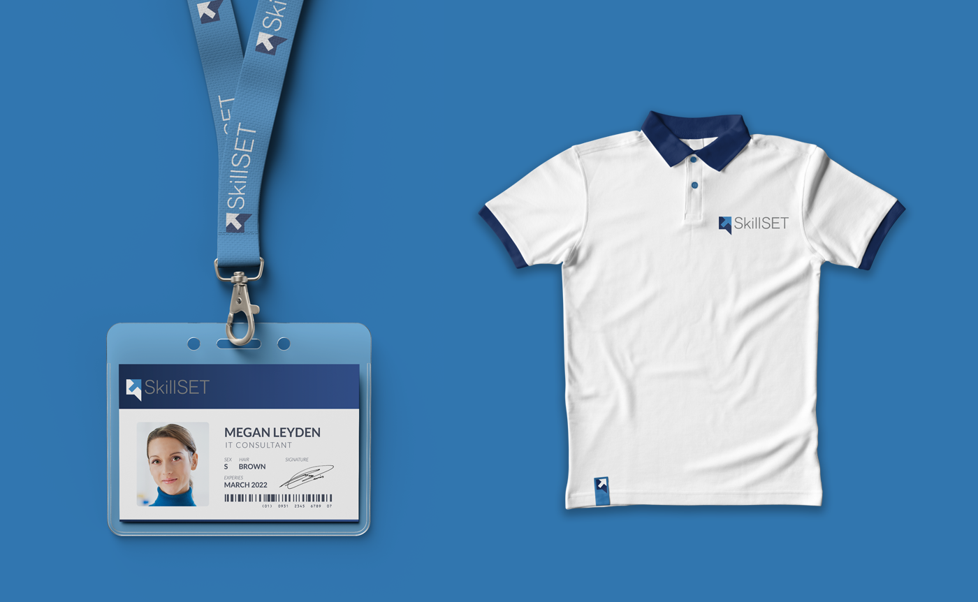
04 / Applications
05 / Landing Page
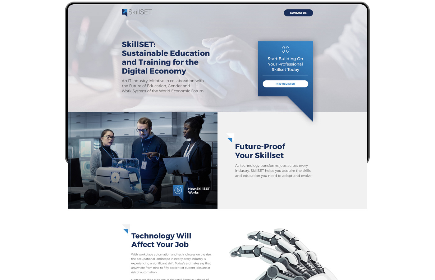
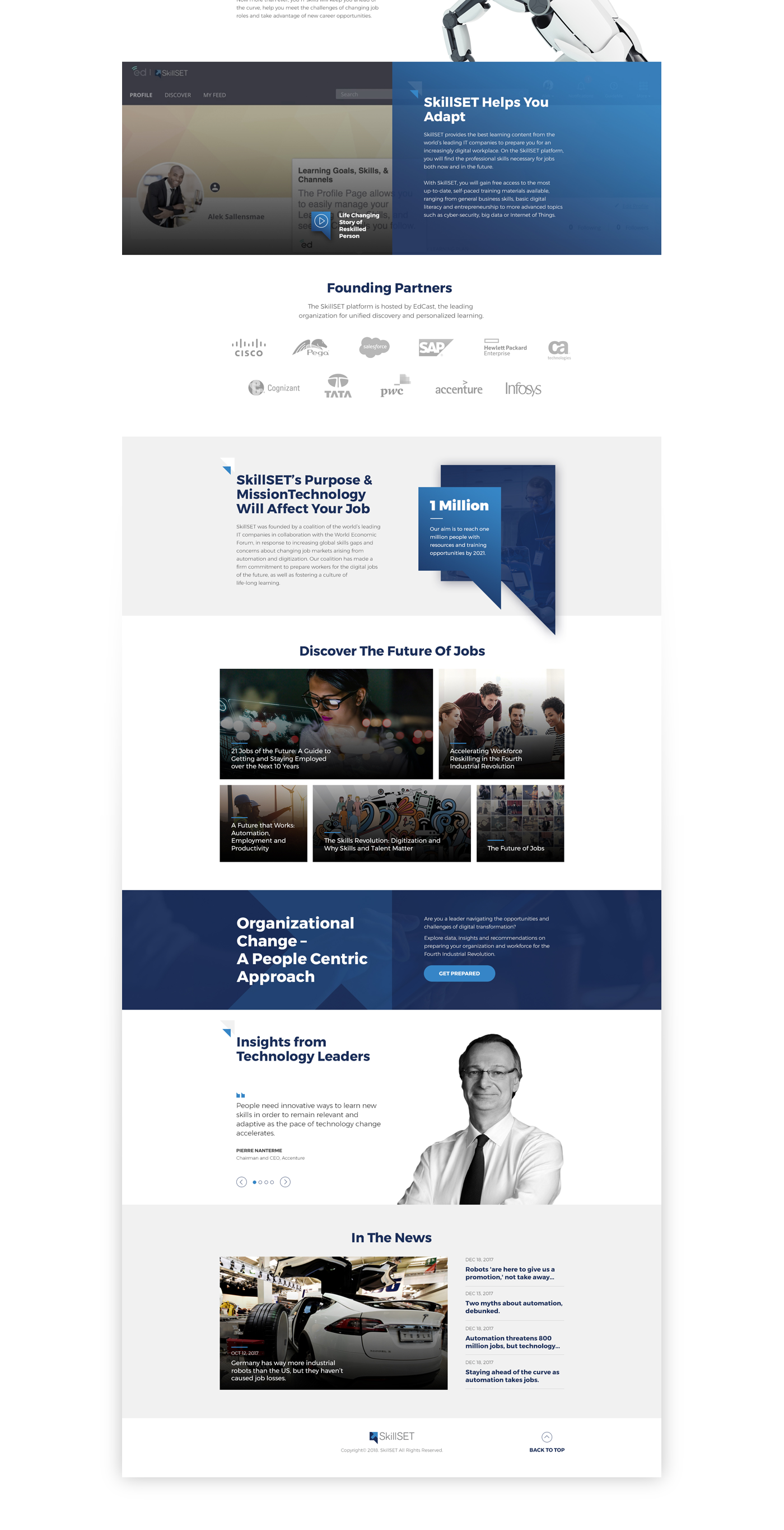
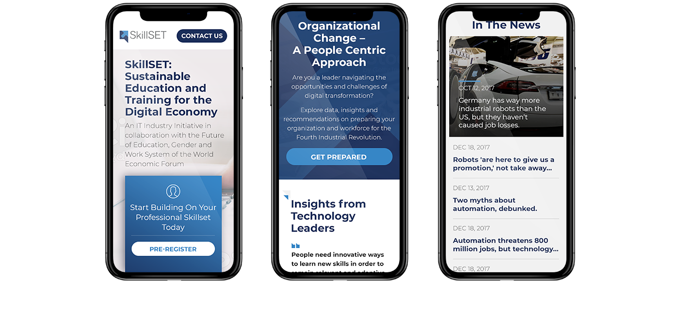
Working with my team, I art directed the design of the responsive landing page. All the main concepts that brought the logo to life were considered when designing the landing page. It needed to be approachable yet professional.
Tech and contemporary the goal of this page is to inform the user what SkillSET is all about, helping them quickly find what they need and encourage them to sign up. We crafted the design with a mobile-first approach, knowing that our targeted audience is primarily using the phone to access the website.