OUTFITTERS REVIEW - GORCO
GORCO is a startup company run by a father and son duo who are avid hunters and outdoorsmen. They saw a need for a better way to search for, research, and contact guides and outfitters across the country for fishing and hunting trips. This site is looking to become the one-stop destination for enthusiasts to do just this.
01 / Concepts

02 / Sketches

03 / Typography

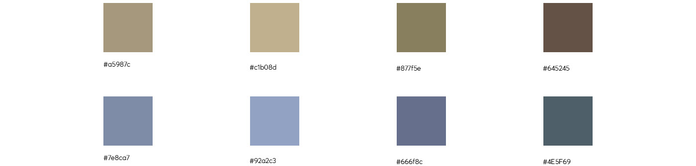
04 / Colors
05 / Final Logos

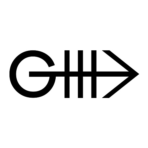
Gorco symbol lives and breathes adventure. I created a logo that symbolizes the outdoor lifestyle. More than just looking for a game, the Gorco audience is searching for a life-changing experience.
That can only be done by the perfect outfitter represented here by the "true path" symbol. When placed sideways, the weapon-like feeling of the arrow evokes the hunting nature of the journey.
Embedded on the letter G, is the idea of the path for hunting and excitement can only be found through Gorco. It's a razor-sharp emblem of hunting and fishing.
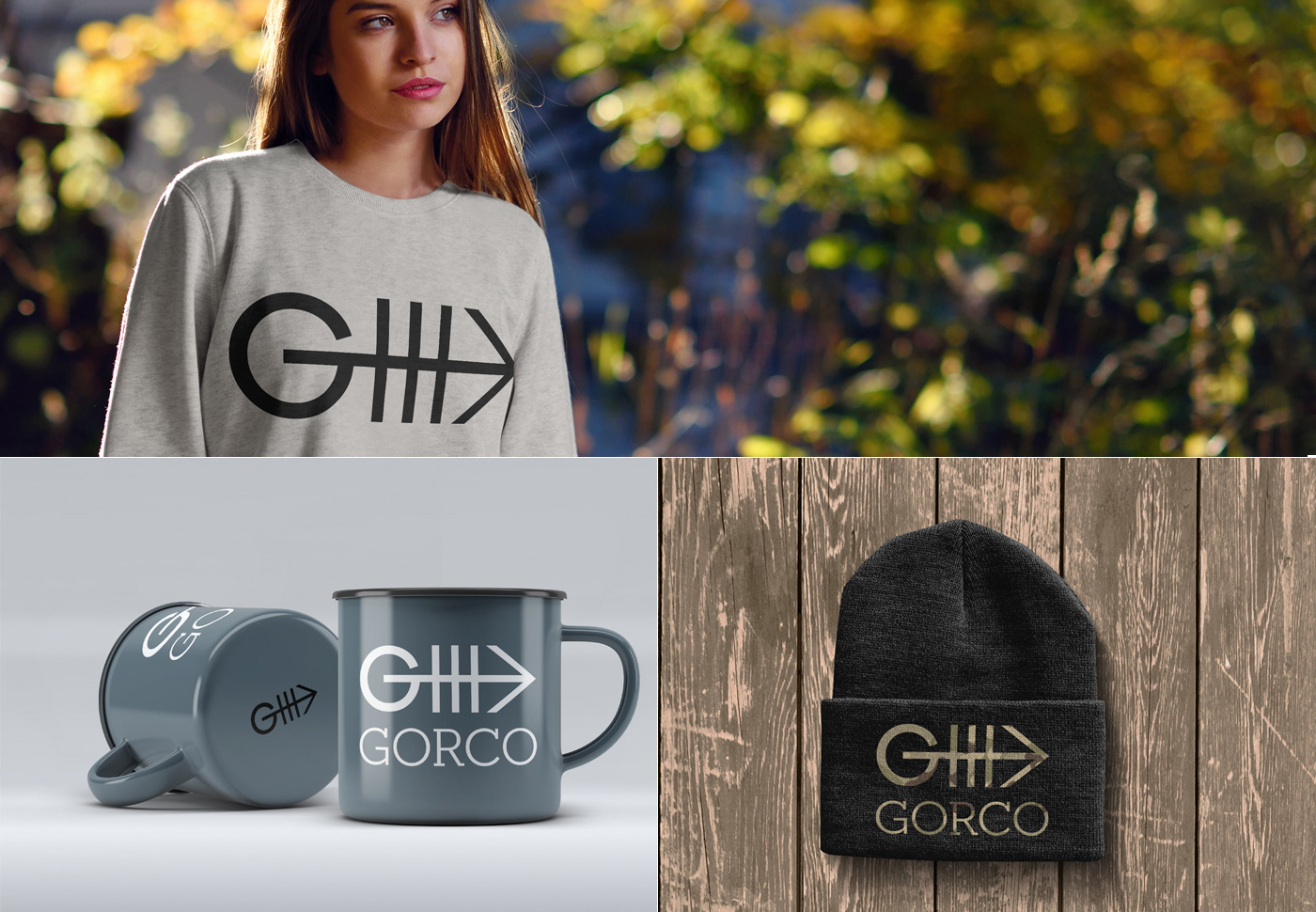
06 / Merchandise
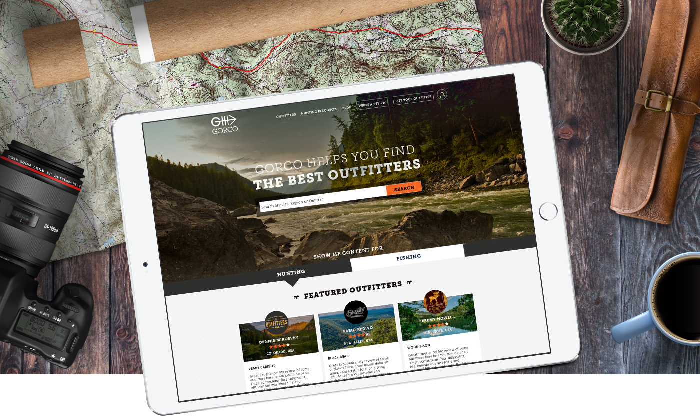
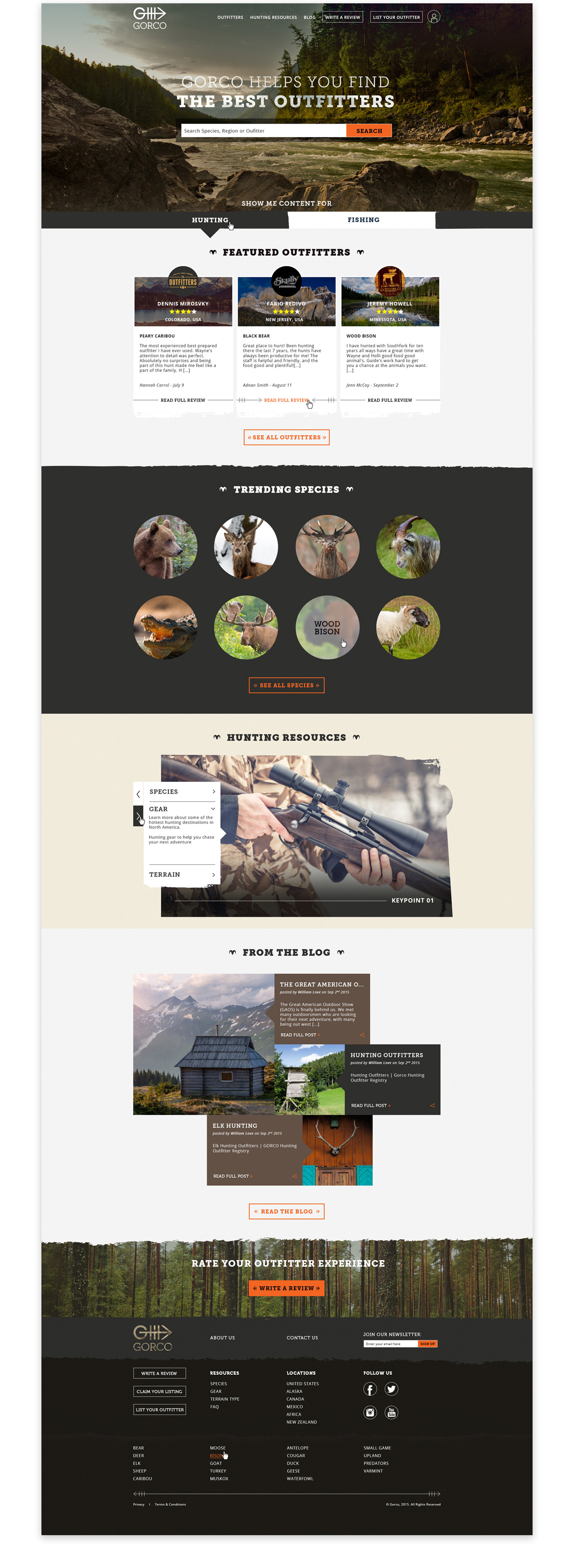
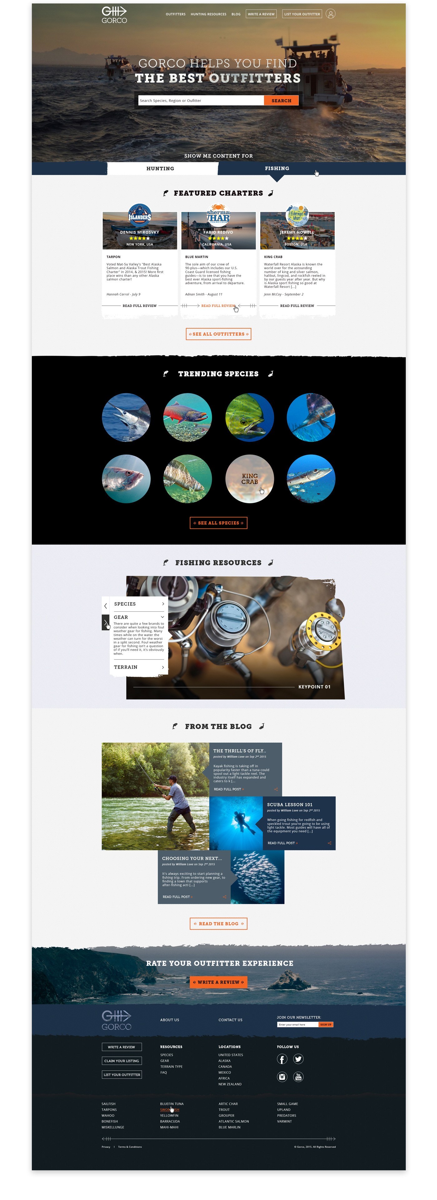
07 / Homepage Design
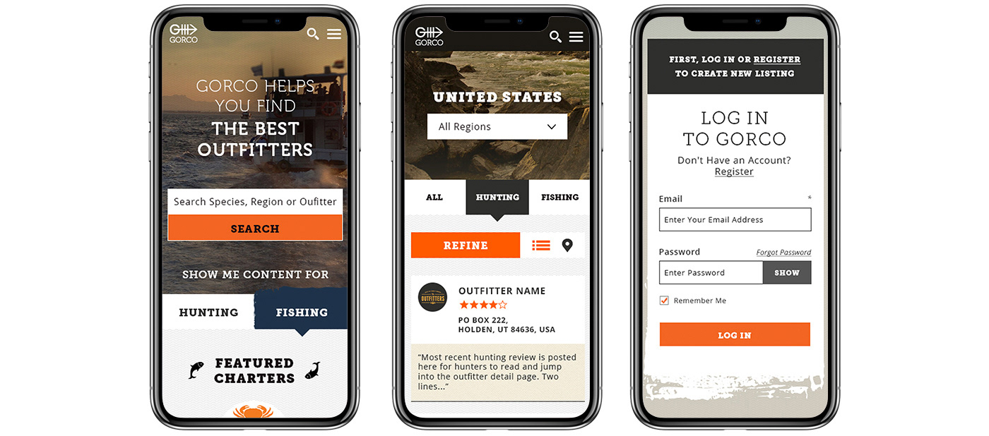
The homepage design for Gorco had to serve the 2 very distinct audiences, the hunting and the fishing crowd. So I created a tab system evident at the bottom of the hero banner. This tab not only toggles between content but dramatically changes the visual design to better suit the viewer.
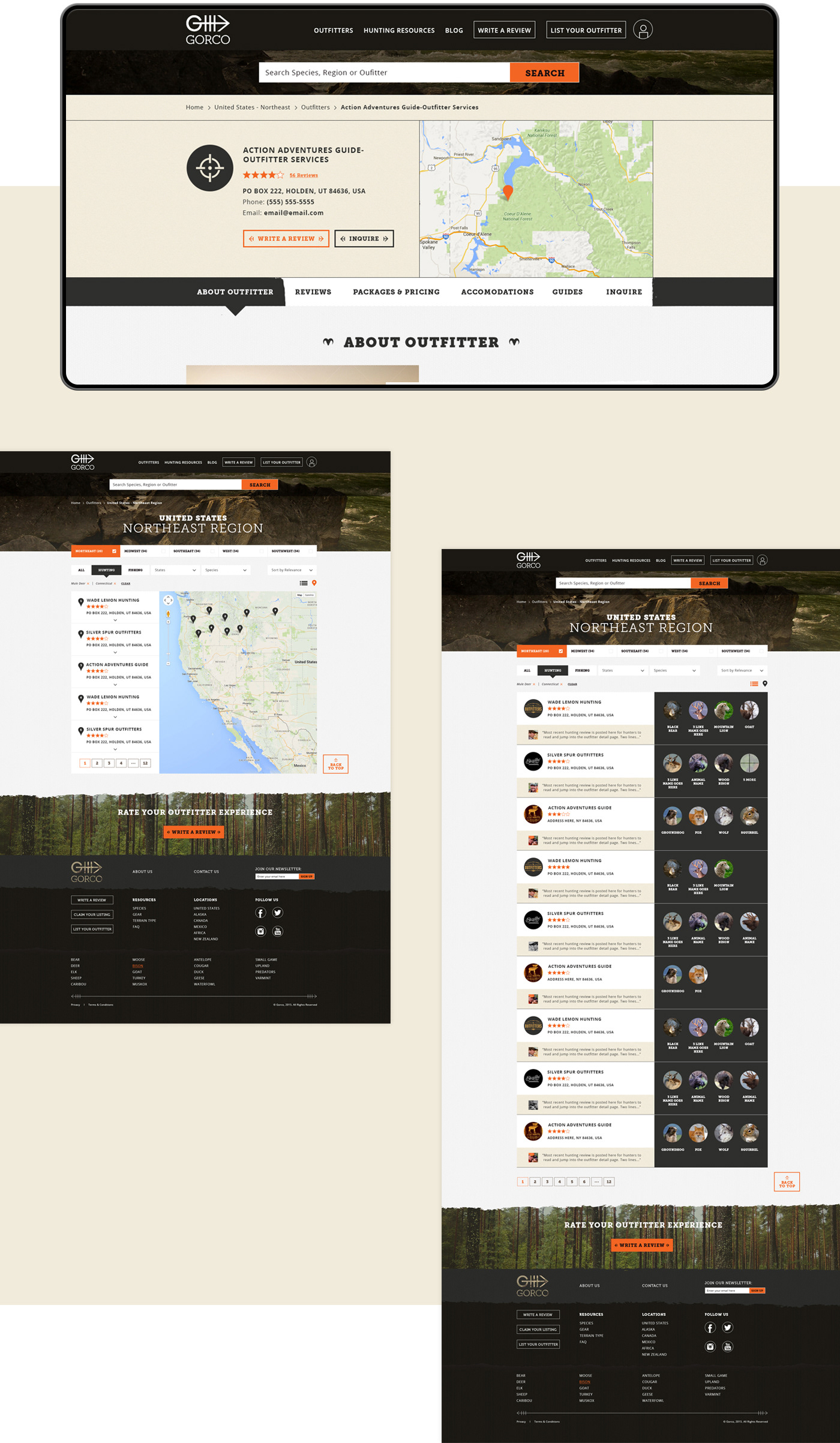
08 / Subpages
A modular approach was considered when designing the subpages. That way, the client can "lego create" pages as necessary following the growth of his business.
I art directed the work created for all subpages paying attention to the design details that were constructing the brand.
09 / Responsive Design