
EQL.CO
EQL.CO is the online destination for both equestrians and non-equestrians to shop authentic equestrian pieces.
Their goal is not just to display brand products but to build productive relationships with top brands. Through custom-curated styles, EQL.CO best demonstrates the integrity of the brand. EQL.CO also documents the global travels of Editor-In-Chief Hannah Madsen and features equestrian goods and happenings from around the world.
01 / Concept

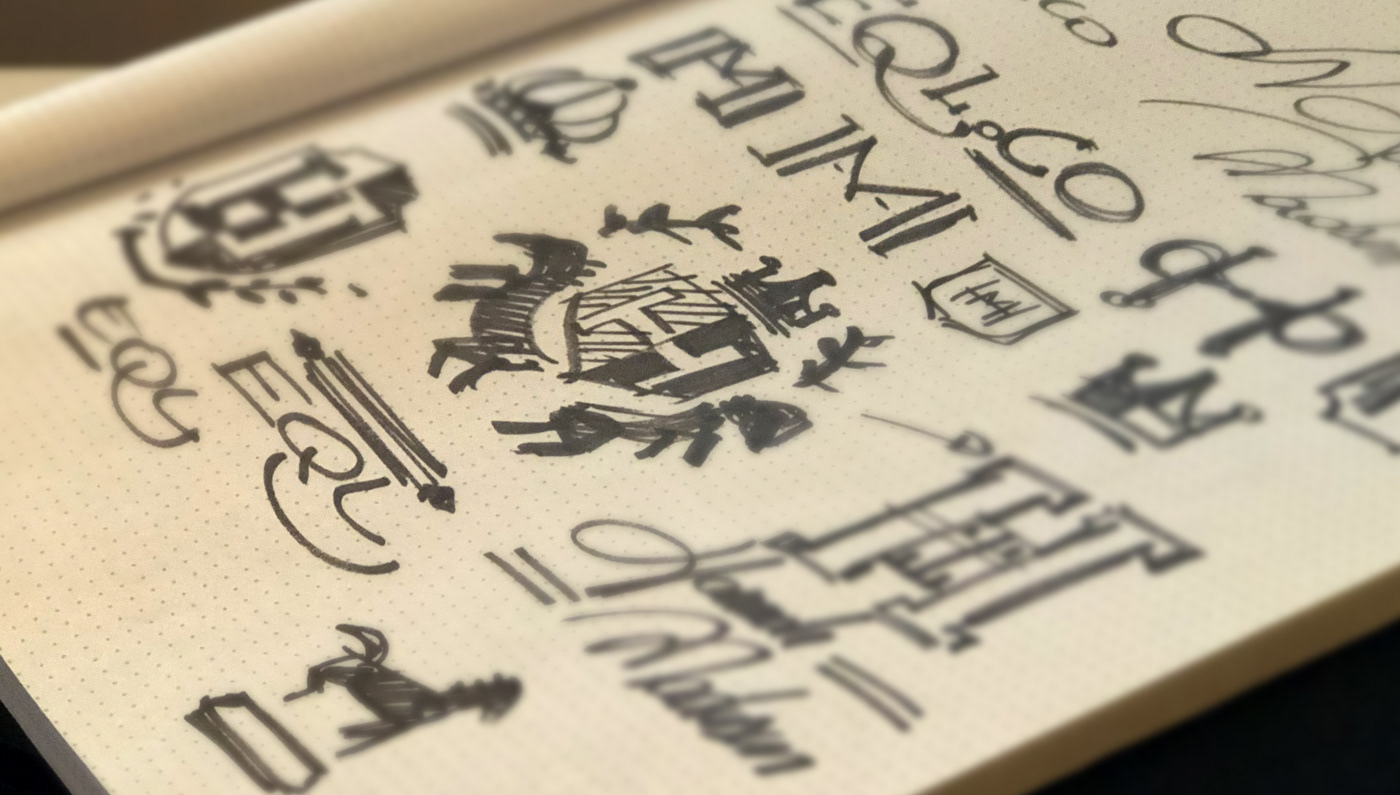
02 / Sketches
03 / Typography and Color

04 / Final Logo

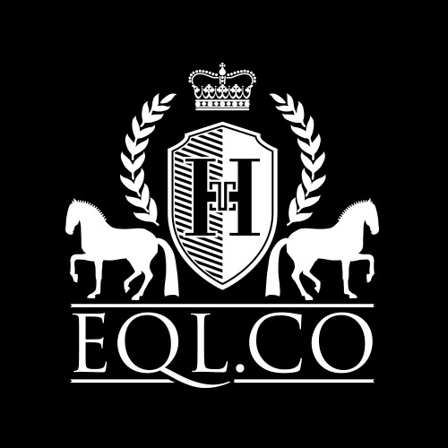
I designed the logo for EQL.CO based on several requests made by the client. One of her main concerns was "how will people know that it is dot co and not dot com. I decided then to make the URL part of the mark to avoid any confusion.Trajan Pro 3 was a natural choice, as the tail of the letter Q works as a directional path from the domain name to the extension.
A lot of work was also put to the horse pose to a classic yet distinct dressage exercise.The custom made crown and laurel bring a royal/classy feel found on dressage and equestrian sports.
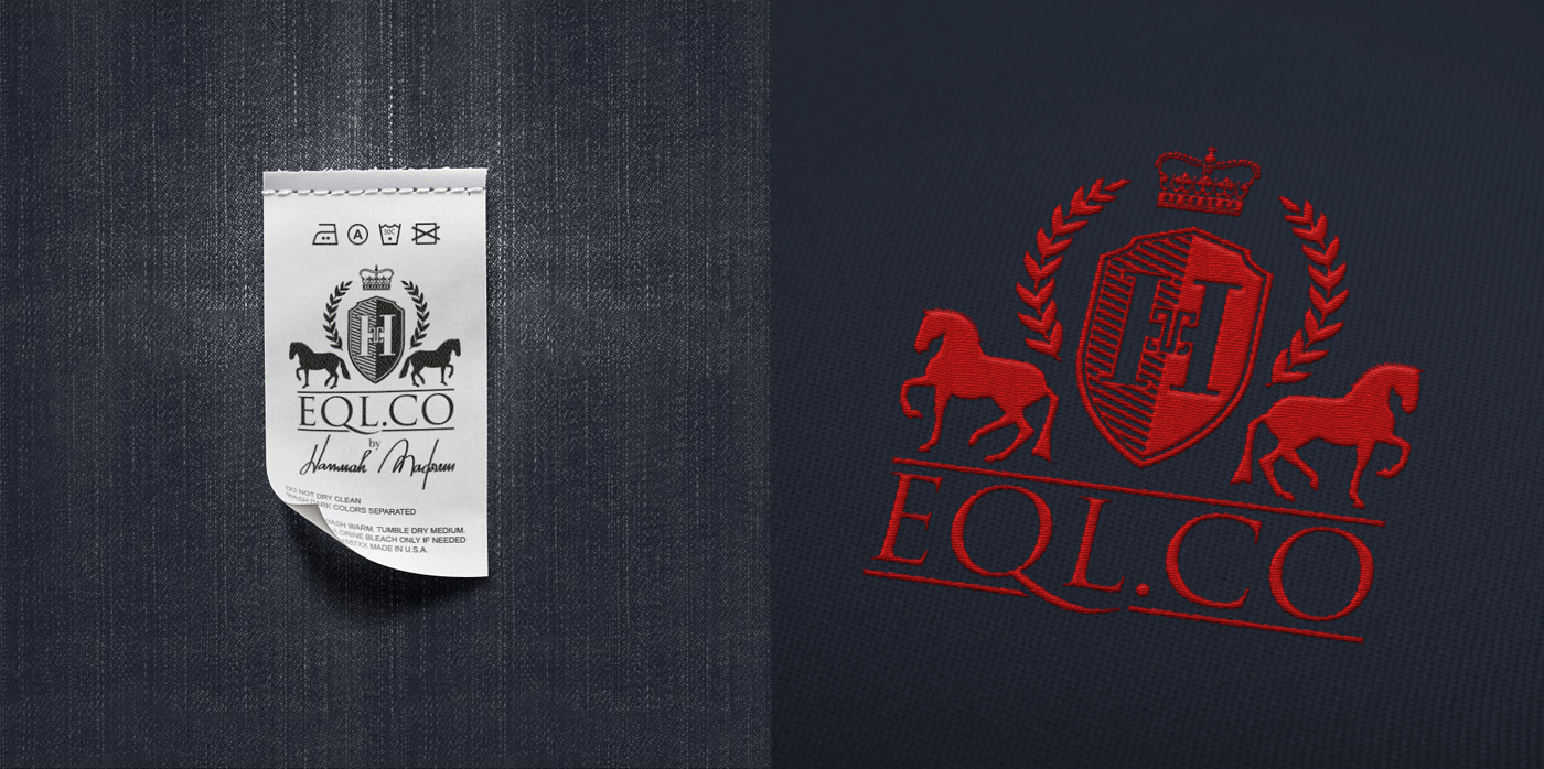
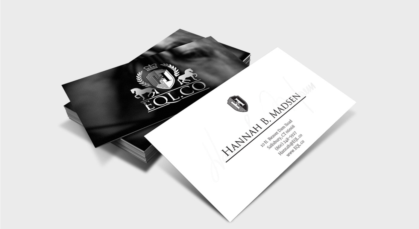
One very subtle but iconic detail of this logo is the monogram carved inside the shield. The letters H and M, initials of the founder Hannah Madisen, were based on the design of the saddle buckle that locks under the horse.
Such a unique monogram can be extracted from the logo and be used on itself to represent the company. Throughout the brand breathes equestrian lifestyle.

05 / Business Card and Media Kit

06 / Social Media


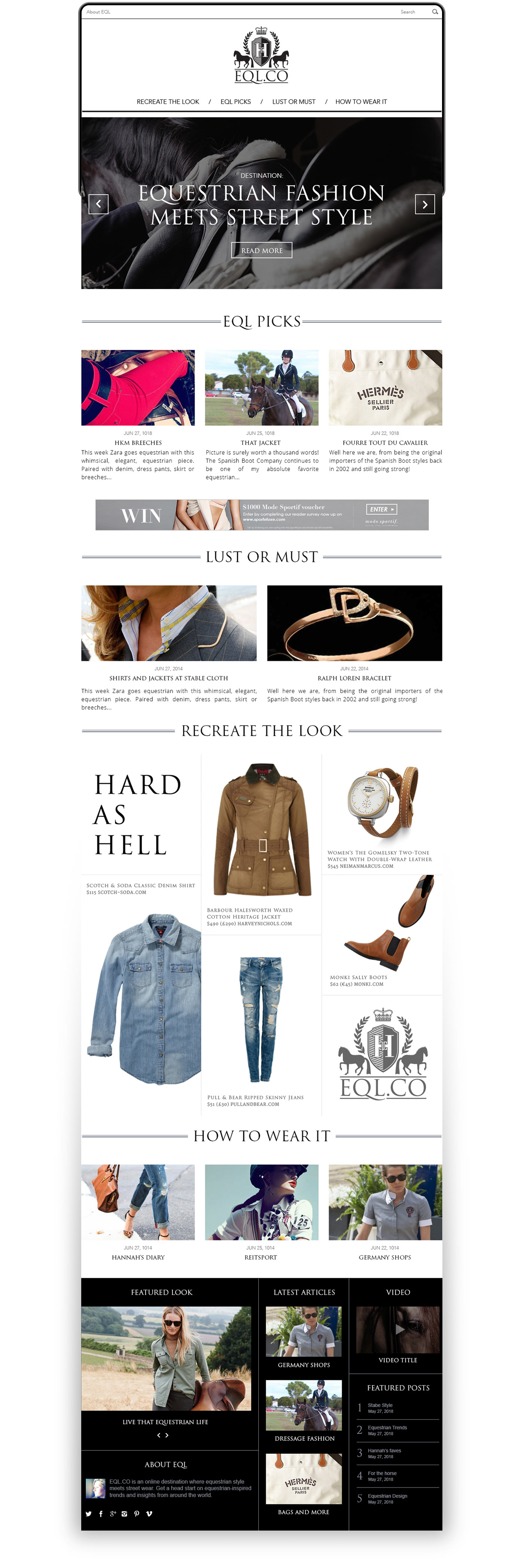
07 / Homepage Design
The entire website was designed to mimic a digital magazine with a solid editorial look and feel. The minimal use of elements invites the user to browse articles and easily find their interest. The splash of colors fits perfectly with the usage of high-quality custom photography to each and every post.
08 / Responsive Design