
BETWEEN THE BREAD
For over four decades, Between The Bread has provided New Yorkers with unmistakable quality and locally-sourced food. As time went by, their visual communication changed with the trends of the period.
When I was in charge of this project, my main goal was to create a logo and develop a concept that would stand the test of times, with a design that would represent the company, its principals and goals.
01 / Concepts

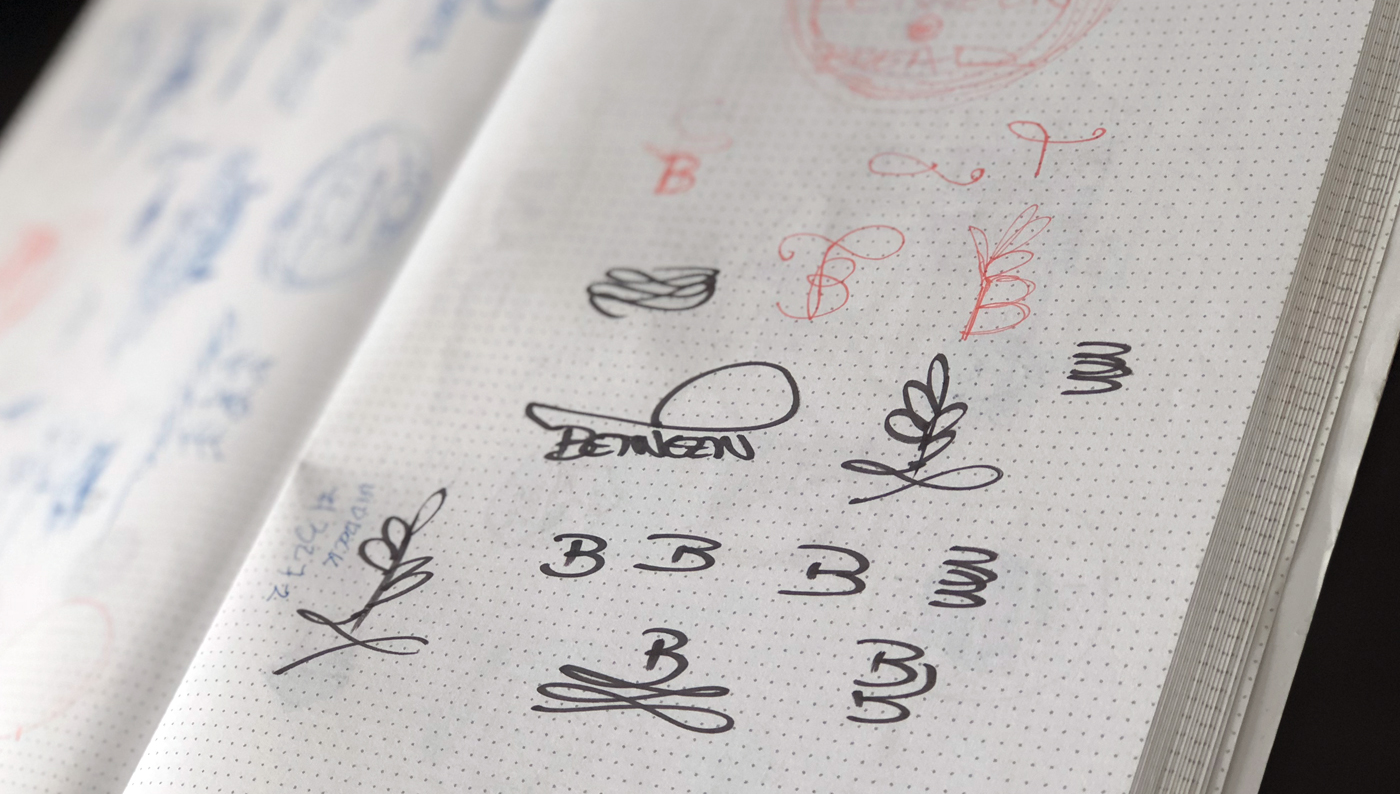
02 / Sketches
03 / Typography

04 / Colors

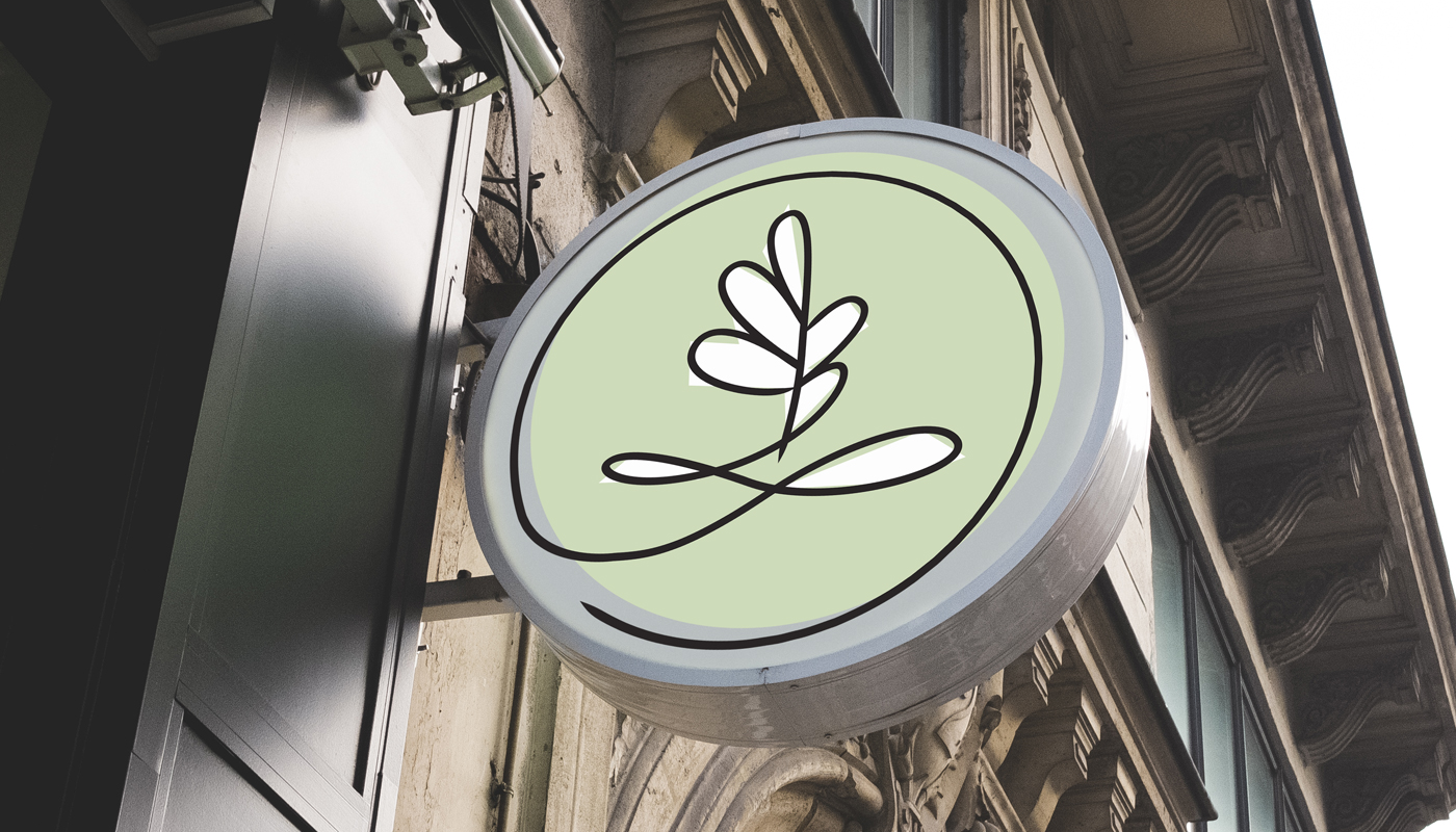
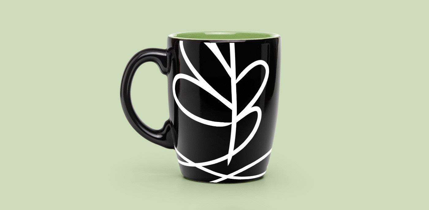
05 / Final Logo


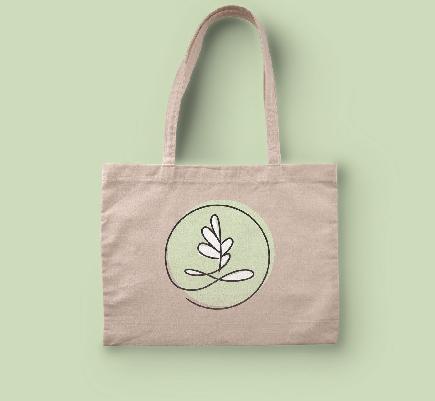
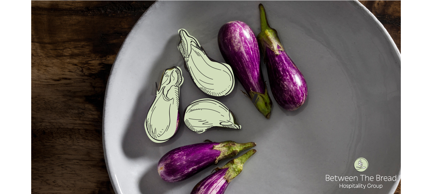
I designed the logo for Between the Bread to look and feel soft, natural, and organic. It was essential to have this natural feel, as they are very concerned about the source of their ingredients and produces. The logo has a hand-made quality that evokes the home-cooking feeling, yet it has well-crafted curves that speak sophistication and elegance. Between The Bread is not just another place to eat - they are the savory choice.
The leaf color around the design is cut off using sharp angles, giving the symbol a cutting edge structure that ties with the company's constant innovations. This is not just another organic-looking brand; it's a complex composition. Symbolizing the pride and heritage of this female-owned business, the leaf symbol was created based on the initials of the company, BTB, which is the way they call it between their internal team.
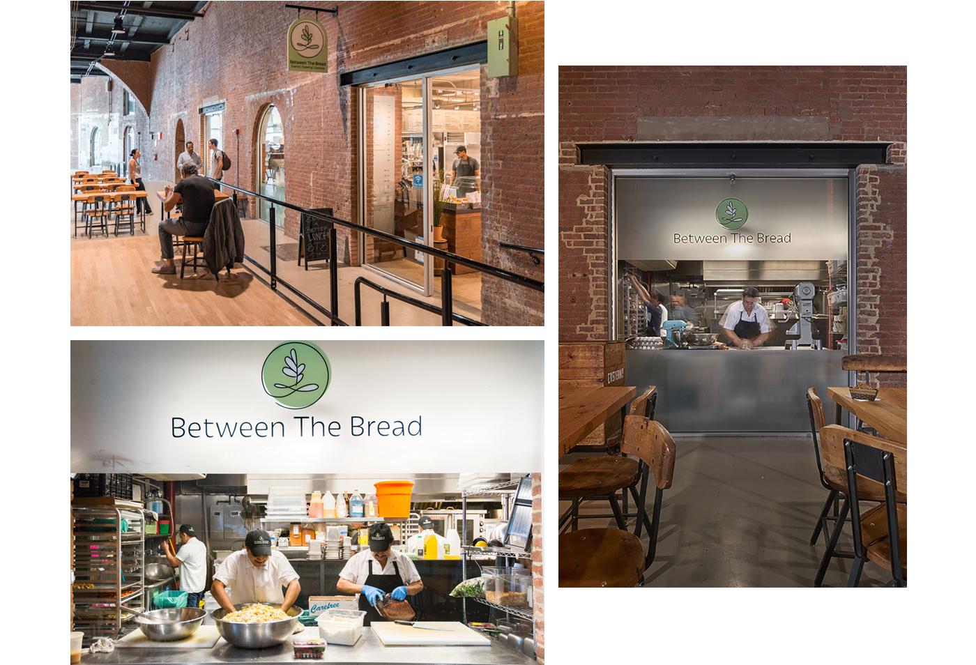
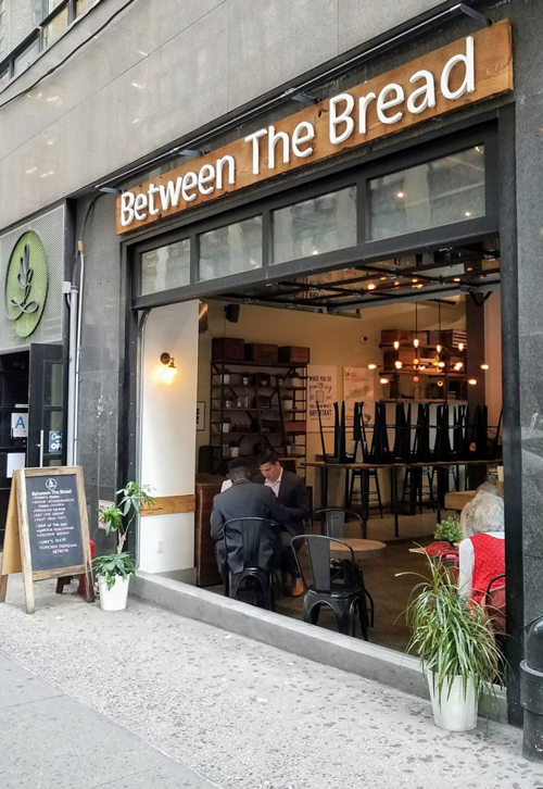
06 / Applications


07 / Store Pictures
08 / Social Media

When I was 17 years old, I did my very first professional logo design. I was shopping for a friend's birthday gift when I overheard my mom talking to the owner. "My son can draw," she said. They were looking for somebody that could do illustration and a logo for their new skate/streetwear fashion brand called Spit Power. I got the job, I guess I was the cheapest option at the time for them. And even though I never saw anybody wearing a SpitPower t-shirt, I remember the feeling when I saw the logo embroidered on the t-shirt tag. It felt so real, so concrete. There was something I designed in the real world.
Fast forward almost 30 years, two degrees, a new country, a wife, and three kids later, and here is that feeling again.
Between Madison Ave and 40th street is a new eatery with fantastic farm to table style of cuisine. Between The Bread just opened up its doors to the public, and I have somewhat a lot to do with it. They came to Blue Fountain Media with an idea to rebrand their business that is successful for over 40 years in catering and events. With the help of our amazing design team, I designed their new logo and brand to match the new vision and business goals.
What started as a particular element freehand sketch on my notebook transformed itself into one of the highest points of my carter. Today, if you walk by those streets, you will see my work, big and shiny at the front of their store. You will see embedded in details by the menu, the walls, the workers' uniforms. It lives and breathes as an organic being.
But to me, that is more than a logo. It's a statement, a monument. A reminder that all the hard work paid off. Even if it is in a small drop, in that vast ocean of visual stimulation that is New York City, I helped shape the world's greatest city.